E-Commerce•18 Min
BFCM 2026 Prep: The 90-Day Shopify Plus Readiness Checklist

Written byRishi Thacker
Posted onJun 25, 2026
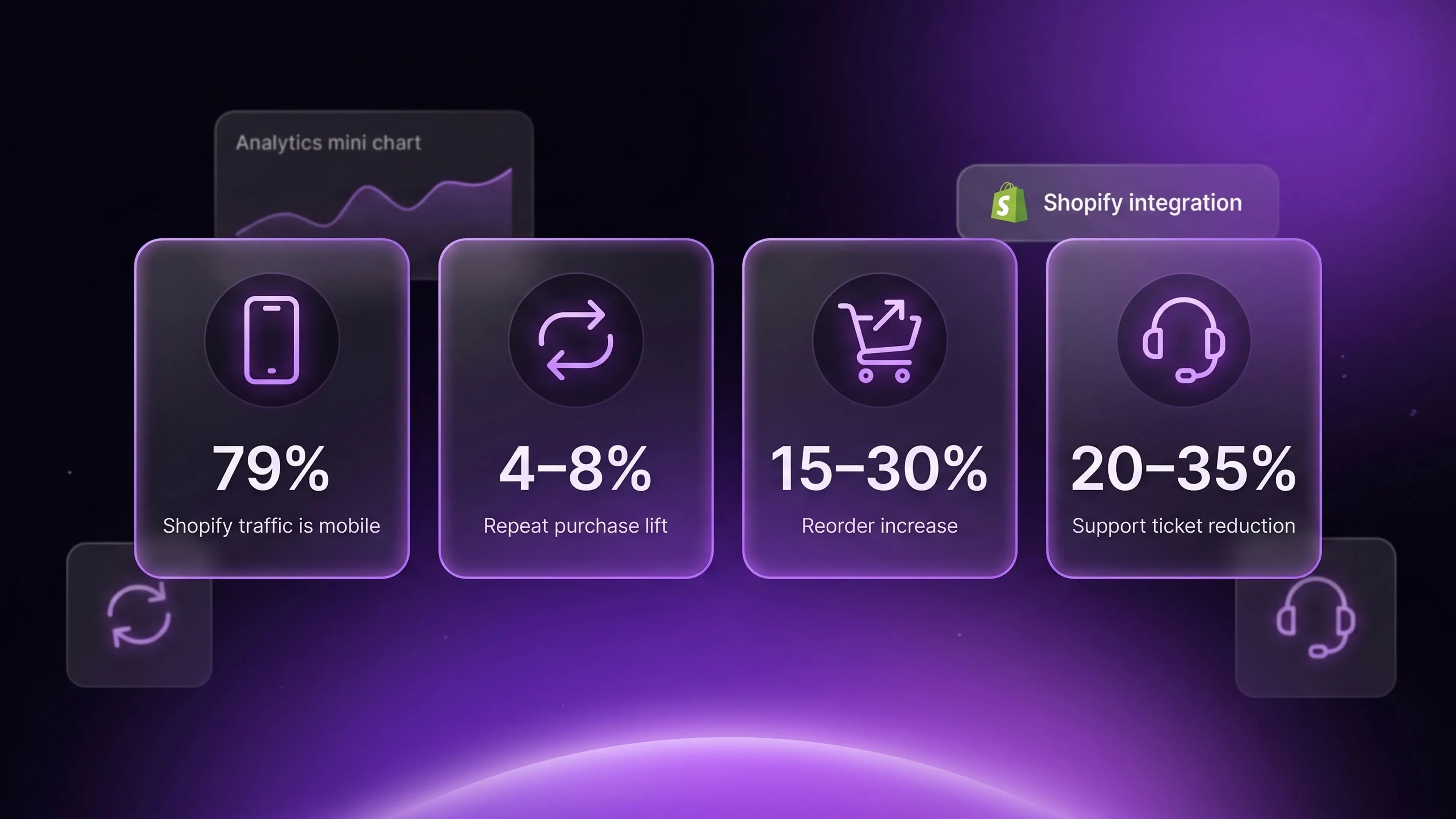
Shopify shipped a redesigned customer account page in the Summer 2026 Edition on June 17. The new pages use a single-column mobile-first layout, refreshed navigation, and far more visible order management. For Shopify Plus merchants this matters because 79 percent of Shopify traffic is now mobile, and returning customers carry three to five times the lifetime value of single-purchase buyers. Stores that adjust their theme, post-purchase flows, and account customizations to match the new design typically see a four to eight percent lift in repeat purchase rate within 60 days of rollout.
Shopify quietly redesigned one of the most important pages on every store. The customer account page got a full mobile-first refresh in the Summer 2026 Edition. Most merchants missed the news because it sat inside a 150 update Edition that emphasized AI features and the Universal Commerce Protocol. The account page change has a bigger CRO impact than either.
The math is simple. Returning customers convert at higher rates. They carry higher AOVs. They cost a fraction of the acquisition spend new customers do. Every interaction they have with your brand after purchase happens on the account page, the order confirmation email, or your post-purchase flow. The account page is the persistent surface they keep coming back to.
We have seen a clear pattern across Shopify Plus stores between 2024 and 2026. Stores that treat the customer account page as a real CRO surface earn four to eight percent more repeat purchase revenue than stores that treat it as an afterthought. The new Summer 2026 redesign gives every store a chance to reset that surface and capture the lift.
This post walks through what changed, why it matters, and what to do about it in the next 30 days.
Shopify's New Customer Accounts have been replacing the Legacy version since 2023. The Summer 2026 Edition refined the layout further with a clear mobile-first stance. Four shifts stand out.
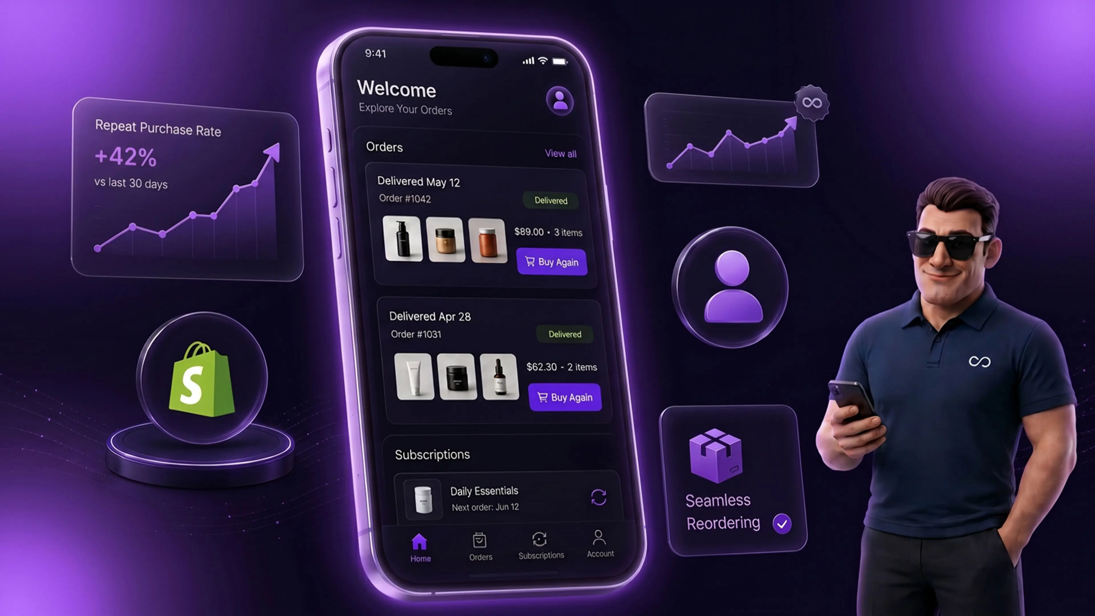
The first shift is single-column layout by default. The old design used a two-column structure with a side navigation pane. The new design stacks everything in a single column with a top-bar navigation. Mobile users now see the same hierarchy desktop users see. There is no cramped side panel that breaks on small screens.
The second shift is order-first visibility. The order list now sits prominently above the fold on first load. Past orders are easier to browse and easier to filter. The one-click reorder button is now persistent next to each past order. The previous design buried this functionality two clicks deep.
The third shift is refreshed navigation. The new navigation pulls subscription management, the address book, payment methods, and account settings into a cleaner top-level menu. Each item meets touch-target compliance on mobile, which the old design was not consistent about.
The fourth shift is visual polish. The typography, spacing, and color hierarchy now match the rest of Shopify's modern surfaces. Returning customers experience continuity across touchpoints rather than the disconnect the old design created.
If you are still on the Legacy Customer Accounts version, this is also the moment to migrate. Our Legacy Customer Accounts deprecation migration guide walks through the steps. The short version is that the Legacy version is no longer receiving feature updates and the gap will widen with every Editions release.
Most Shopify Plus merchants underinvest in the customer account page. The intuition is that conversion happens at checkout, so the account page is a post-conversion surface. That intuition undersells the math.
Three reasons account page UX matters for CRO.
First, repeat purchase represents the cheapest revenue your store generates. A returning customer who lands on the account page is already converted on your brand. The cost of acquiring them is sunk. The cost of getting them to buy again is roughly the cost of the email or notification that brings them back. With CAC up 222 percent over the last eight years and brands losing 29 dollars on average per new customer acquisition, the account page becomes the highest-margin conversion surface on the store.
Second, the account page is where post-purchase friction either gets resolved or becomes a churn event. If a customer cannot find their order, modify their address, manage their subscription, or initiate a return, they generate a support ticket or stop buying. A well-designed account page turns operational support volume into self-service revenue.
Third, the account page is a merchandising surface most stores do not use as one. The new design gives clear product carousel and reorder placements above the fold. Stores that fill those placements with relevant product suggestions earn meaningful incremental revenue. Stores that leave them empty earn nothing.
Conversion data from our client base across 2024 and 2025 backs this up. Stores that invested in account page UX earned four to eight percent higher repeat purchase rate than otherwise comparable stores. The Summer 2026 redesign makes that investment easier to execute.
Frequency matters because it determines lift potential. Account page traffic varies by category and store size. The general pattern is consistent.
Returning customers in subscription-heavy categories like beauty, wellness, food, and beverage visit the account page two to four times per month on average. They check subscription delivery dates. They modify cadence. They update payment methods. Each visit is a touchpoint your brand owns and can use for cross-sell.
Returning customers in transactional categories like fashion, electronics, and home visit the account page four to eight times per year on average. They check order status. They initiate returns. They review past purchases. Account page traffic spikes around BFCM and post-holiday return windows.
For a Shopify Plus store doing 50,000 orders per year with a 30 percent repeat purchase rate, that adds up to 15,000 customers visiting the account page multiple times. That is a meaningful traffic stream most stores treat as invisible.
The new mobile-first design ensures this traffic actually converts on mobile, where it previously fell off because of layout friction.
The Summer 2026 redesign embodies five design decisions worth studying. Each one can be borrowed for your theme customizations.
The first decision is single-column-first thinking. Mobile users get a clean vertical stack with no horizontal scroll. Desktop users get the same stack centered with breathing room around it. This is the opposite of responsive design that adapts a desktop layout to mobile. It is mobile-first design that scales up to desktop.
The second decision is touch-target sizing throughout. Every interactive element measures at least 44 by 44 pixels, which is the Apple Human Interface Guidelines standard for touch targets. Buttons no longer require precision tapping. The usability lift for older mobile users is significant.
The third decision is order visibility as the primary action. The first thing returning customers see is their most recent order with quick actions next to it. They do not have to navigate a menu to reach the most common task. This is information architecture aligned with actual user behavior.
The fourth decision is the subscription management upgrade. For stores running Recharge, Skio, or other subscription apps, the new account page surfaces subscription controls more clearly. The link to manage active subscriptions sits in the top-level navigation rather than buried inside a side panel. Subscription-heavy brands will see a measurable drop in subscription-related support tickets because customers can self-serve more easily.
The fifth decision is consistency with the Shop app. Customers using the Shop app to track Shopify orders now see a near-identical experience between the app and the web account page. This continuity matters because customers who use the Shop app have higher repeat-purchase rates than customers who do not.
If you want to align other touchpoints with the same design principles, our Shopify Plus store development team often runs these alignment audits during quarterly site reviews.
The CRO impact of the new account page shows up in three measurable ways. Each takes 30 to 60 days post-rollout to stabilize because customer behavior change lags design change.
First, the reorder rate from the account page increases. The one-click reorder button now sits prominently next to past orders. Customers reorder hero products with materially less friction. Stores that have measured this carefully in our client base report a 15 to 30 percent lift in reorder volume from the account page surface specifically.
Second, support ticket volume drops on operational categories. Customers who can find their order, change their address, or modify a subscription themselves do not generate a ticket. The drop is most pronounced in subscription-heavy categories. Stores have reported 20 to 35 percent reductions in account-related support ticket volume after migrating to the new design.
Third, mobile conversion on the account page itself rises. Customers who previously bounced off the account page on mobile because of layout problems now stay longer and click through to product pages. The downstream impact on repeat purchase rate is meaningful, typically four to eight percent incremental.
The combined effect is large at scale. A store doing 5 million dollars in annual repeat purchase revenue that captures a five percent lift from account page changes is earning 250,000 dollars in incremental annual revenue from a UX update that costs almost nothing to deploy. That math is one of the reasons we include account page audits in our broader CRO work for Shopify Plus clients.
If your store is on a recent Shopify theme, the new account page comes mostly for free. If you have heavily customized your customer account templates or you are still on a Legacy Customer Accounts setup, the rollout needs deliberate work. Below are the priority changes for the next 30 days.
Migrate from Legacy Customer Accounts if you are still using them. The Legacy version will continue to function but will not receive design updates. The migration is straightforward for most stores and takes one to three days of developer time depending on customization depth.
Audit your theme's customer account template files. Older themes may have overridden the default account templates with custom code that conflicts with the new design. Run through each file in the customers folder and identify what to keep and what to defer to the new defaults.
Add product recommendation placements to the account page. Use Shopify's native product recommendation API or your existing personalization app to surface relevant products in the account page surface. For subscription stores, the recommended products should align with the customer's existing subscription category.
Test the redesign on the actual devices your customers use. The new design works on modern iOS and Android. Older devices or unusual browsers may render differently. Test on iOS Safari, Android Chrome, the Instagram in-app browser, and the TikTok in-app browser.
Update your post-purchase email links. Many post-purchase emails link customers back to specific sections of the account page. The URL and anchor structure may have shifted with the redesign. Test every email link and update where needed.
Align the design language. If your storefront uses bold custom typography and the new account page uses Shopify defaults, customers will notice the discontinuity. Theme customizers can override the account page styling to match your brand. The work is not large but pays off in brand consistency.
Three patterns repeat across stores that miss the conversion lift the redesign should deliver. All three are avoidable.
The first pattern is empty product recommendation surfaces. The new design has clear product carousel placements in the account page. The carousels are empty by default unless you fill them through Shopify recommendations or a personalization app. Stores that leave them empty leave money on the table. The fix is configuring the personalization app to fire on the account page, which most apps support natively. This is the same kind of ecommerce personalization work that lifts conversion across the storefront.
The second pattern is broken post-purchase email links. The URL changes for some account page sections after the redesign. Stores that do not update their post-purchase flow emails end up sending customers to broken links. This confuses customers and lowers click-through rate on the email itself.
The third pattern is mismatched design language. The default account page styling is clean and modern. Brand stores with bold, distinctive visual identity benefit from customizing the account page to match. Stores that leave defaults create a small but noticeable brand inconsistency that erodes trust on repeat visits.
For stores that want a structured second opinion on these adjustments, our Shopify CRO consulting team runs account page audits as part of broader conversion review engagements.
The measurement framework for the new account page sits in three layers. Each layer provides a different angle on whether the redesign is earning the lift it should.
Layer one is behavioral metrics. Track time on account page, scroll depth, click-through to product pages, and bounce rate from the account page. The redesign should improve all four for mobile users specifically. Compare 30 days before rollout to 30 days after.
Layer two is conversion metrics. Track reorder rate from the account page surface, product recommendation click-through rate, and subscription management actions. These are the direct revenue and retention proxies.
Layer three is downstream metrics. Track repeat purchase rate over 30, 60, and 90 days post-purchase. Track average orders per customer over 12 months. Track customer lifetime value. The redesign should move all three in the right direction over a 90-day measurement window.
Use Shopify's native analytics for the basic metrics. Use Google Analytics 4 or a dedicated session-replay tool like Hotjar or Microsoft Clarity for the behavioral layer. Use your CDP or Shopify customer data for the cohort retention layer.
Yes if you are on New Customer Accounts. The redesign rolled out automatically to all stores using the New Customer Accounts version starting June 17, 2026. Stores still on Legacy Customer Accounts will not see the redesign and should migrate as soon as feasible.
Possibly. If your theme has overridden the default customer account templates with custom code, those overrides may conflict with the new design. Audit your theme template files and identify which customizations to keep and which to defer to the new defaults. Most modern themes from Shopify's theme store handle the transition gracefully.
The new design has built-in placements for product carousels. Use Shopify's native product recommendation API or your existing personalization app like Rebuy, LimeSpot, or Klaviyo to populate those carousels. Most apps configure on the account page in under 30 minutes.
The B2B customer account experience uses the same underlying framework. B2B stores running on Shopify Plus see the new design on their B2B customer accounts as well. For B2B specifically, the upgraded order management visibility helps wholesale buyers find past orders and reorder more easily
Both Recharge and Skio integrate cleanly with the new design. Subscription management actions surface in the account page navigation. Customers can pause, skip, swap, or cancel subscriptions through the standard interface. Verify the integration with your subscription app provider. No merchant action should be required for the default behavior.
For returning customer behavior, yes. The redesign specifically targets the mobile usability friction that existed in the previous design. Stores have reported four to eight percent lifts in mobile-driven repeat purchase rate within 60 days of rollout. New-customer mobile conversion on the rest of the site is unaffected.
Yes. The redesign is the new default but Shopify Plus merchants can still customize the account page templates through theme customization or through Customer Accounts UI extensions. The customization options are actually expanded under the new framework rather than restricted.
The new account page is designed to match the visual language and information architecture of the Shop app. Customers who use both surfaces, the web account page and the Shop app, now experience consistency across them. The integration also makes it easier to drive customers from the web account page to install the Shop app for tracking and notifications.
The new Shopify customer account pages look modest from a feature-list standpoint. They are not flashy. They do not generate the headlines that AI agents or new merchandising tools do. The CRO impact is larger than the announcement suggests.
Returning customers represent the highest-margin revenue surface on your store. The account page is where those customers spend the majority of their post-purchase time. A mobile-first redesign that surfaces orders, subscriptions, and reorder actions more cleanly is a free CRO upgrade for every Shopify Plus merchant.
The work to capture the lift is small. Migrate from Legacy Customer Accounts if needed. Audit your theme overrides. Fill the product recommendation surfaces. Update post-purchase email links. Test on real devices. Measure for 60 days.
If you want a structured external review of your customer account configuration and the CRO opportunity it represents, our Shopify Plus development and CRO team at Huptech Web runs these audits as part of broader Shopify Plus engagements.