E-Commerce•24 Min
Top 10 Payment Gateways in the UAE Compared (Telr, Network International, Tabby, Tamara, and More)

Written byRishi Thacker
Posted onJul 15, 2026
We’ve all been there—you’re shopping online, excited to find that perfect thing, but suddenly, you’re lost between menus, categories, and endless clicks.
Navigation is the MVP here. If your navigation is a mess, it doesn’t just annoy people—it kills your conversions and leaves shoppers wondering if they should just go somewhere else.
A lot of eCommerce stores struggle with this. Overloaded menus, confusing categories, and—worst of all—making people click a gazillion times to find what they’re looking for.
And let me drop a little truth bomb—the more clicks it takes to get to a product, category, or checkout, the more likely people are to bounce. Every extra click is basically a mini roadblock between your customer and their Add to Cart moment.
So, in this blog post, we will break it all down. The user journey, the key challenges your users might face with lousy navigation, and a mini checklist on keeping your customers happy turn those clicks into conversions.
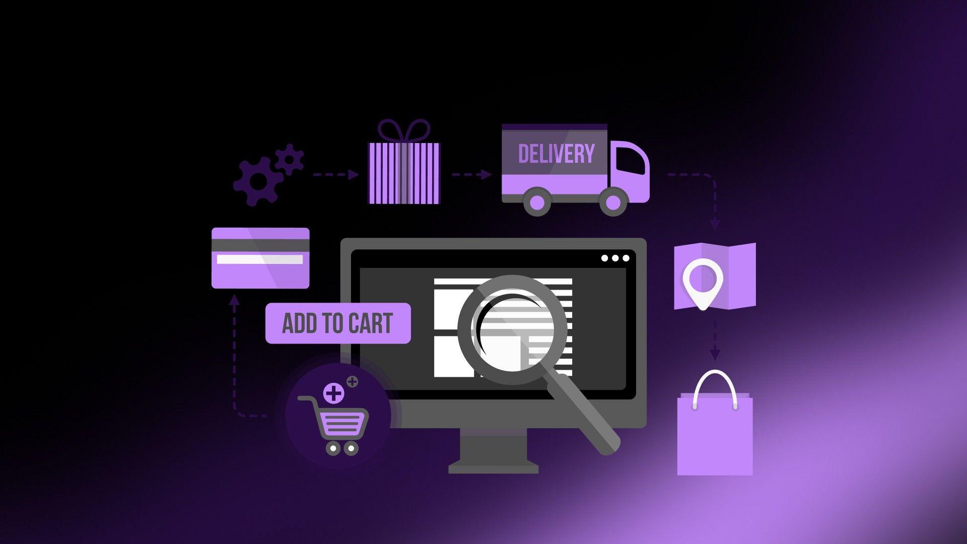
Alright, let's break this down. This user journey is the path your customers take from the moment they land on your site to the moment they hit buy. They'll cruise right through if the path is clear and easy to follow. But if it's full of potholes and dead ends? Well, you can kiss that sale goodbye.
So, what does this journey look like?
This is where it all starts. Someone lands on your site—maybe through an ad, a Google search, or just because they heard about you. They're browsing, checking things out, and trying to get a feel for what you've got—just like window shopping.
Now they're getting serious. They've found something they like and are digging deeper—clicking on product pages, reading descriptions, maybe checking out reviews. This is where they're deciding if your product is the one.
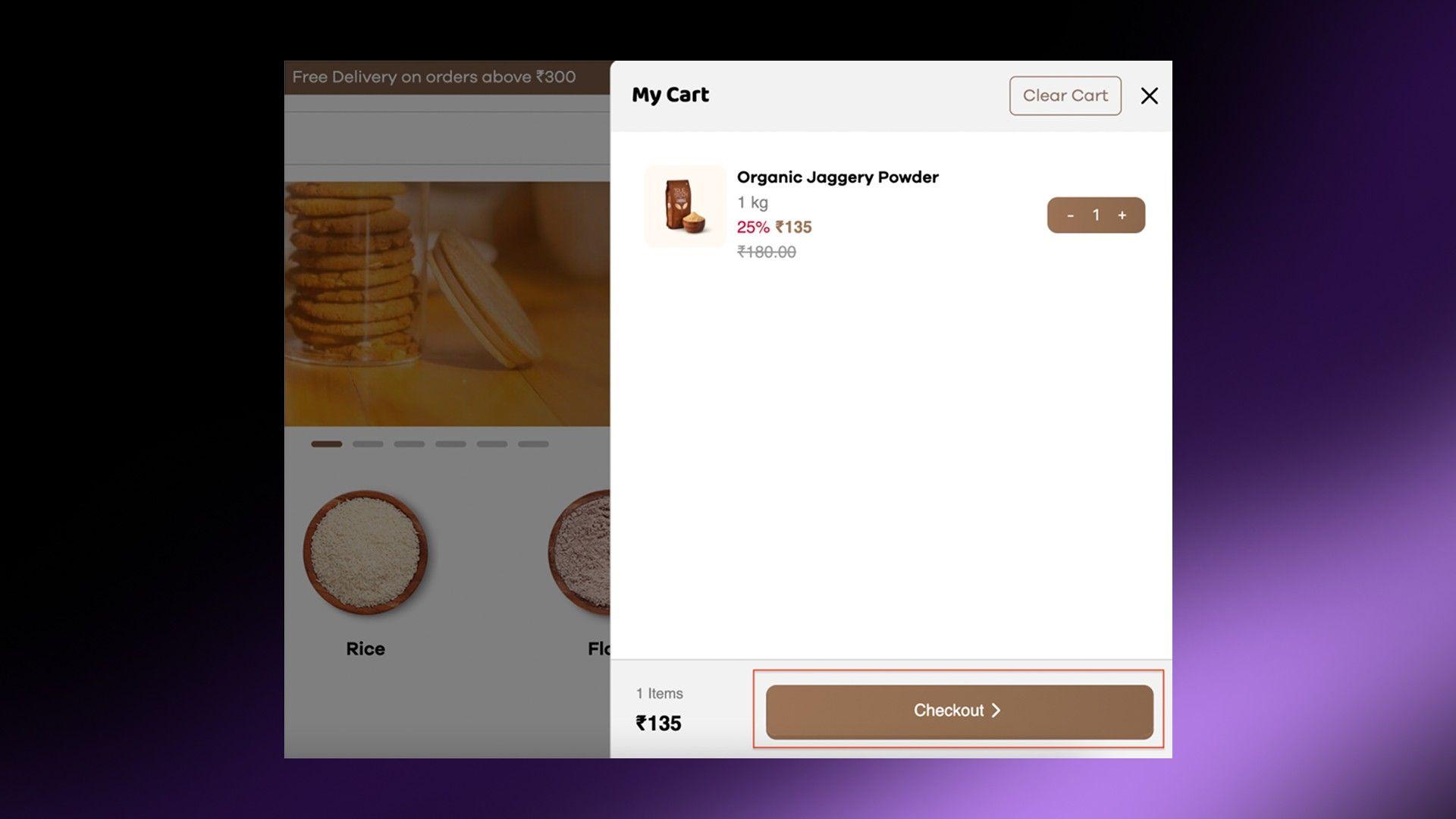
Boom. They're ready to buy. They add the item to their cart, head to checkout, and seal the deal. You've been waiting for this moment, so you want to make it as smooth as possible.
The journey doesn't end at checkout. After they buy, they're looking for confirmation (like an order summary), maybe tracking info, and—if they need it—support. This is your chance to keep them happy and come back for more.
Now, here's the golden rule—clicks matter. The fewer clicks it takes to move through these stages, the better.
So, let's make that journey as smooth as butter, yeah?
Alright, let’s get real for a second. Running an online store isn’t easy, and one of the biggest headaches? Navigation—when it works, no one notices, but when it doesn't? You'll hear about it. Here are the big problems that mess up the shopping experience;
If someone has to click more than 2 or 3 times to find what they're looking for, you've already lost them. Nobody wants that.
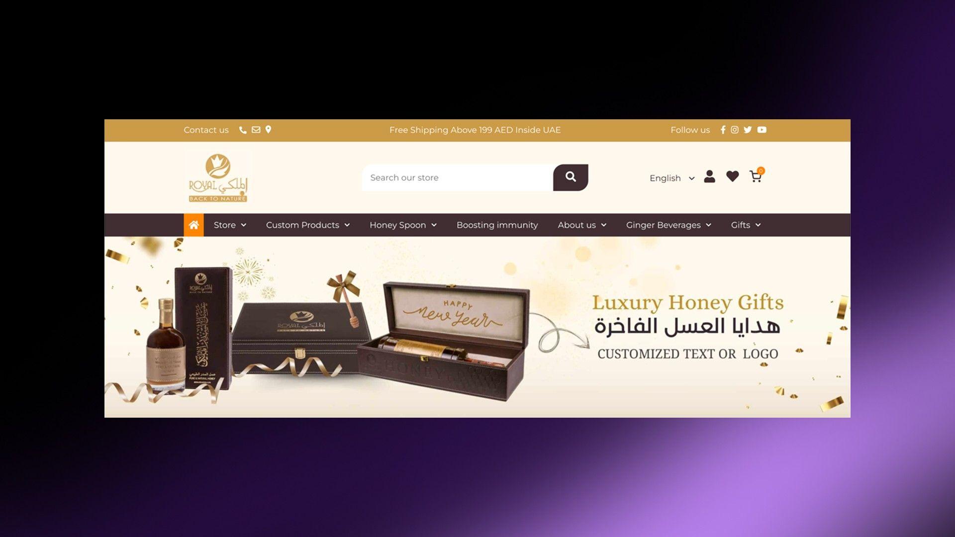
Have you ever seen a menu with a million options? It's too much for your eyes. People don't want to dig through layers of menus to find what they're looking for. Keep it simple.
If your categories are confusing or you don't have good filters, shoppers can't find what they want. Imagine looking for a red dress and having to scroll through 100 products. Filters and clear categories make life easier.
Let's not forget—most people shop on their phones. You're losing customers if your site doesn't work well on mobile. Tiny buttons, weird layouts, and endless scrolling? That's a quick way to make people leave.
If your site takes a decade to load, people won't wait. Think about it—when a site is slow, you close it and move on, right? The same goes for your customers.
If checking out feels like filling out a long form or there are surprise fees, people will abandon their carts. Make it easy for them to buy.
Read More: How to Optimize Shopify Order Confirmation Page?
The thing is, these challenges aren't just minor annoyances—they're straight-up conversion killers.
How? Check this—How Does Website Navigation Affect Conversion Rates in E-Commerce?
But the good news? They're fixable. Let's talk about cleaning up your navigation and making your site where people want to shop.
Let's make your site easier to use. These tips will help you simplify navigation so people can find and buy what they need without getting frustrated.
☑️Keep your menus simple and easy to read.
☑️Use clear categories and subcategories—no confusing jargon.
☑️Stick to 5-7 top-level menu items. Too many options overwhelm people.
Goal: Home → Product Category → Product Page in 2 clicks max.
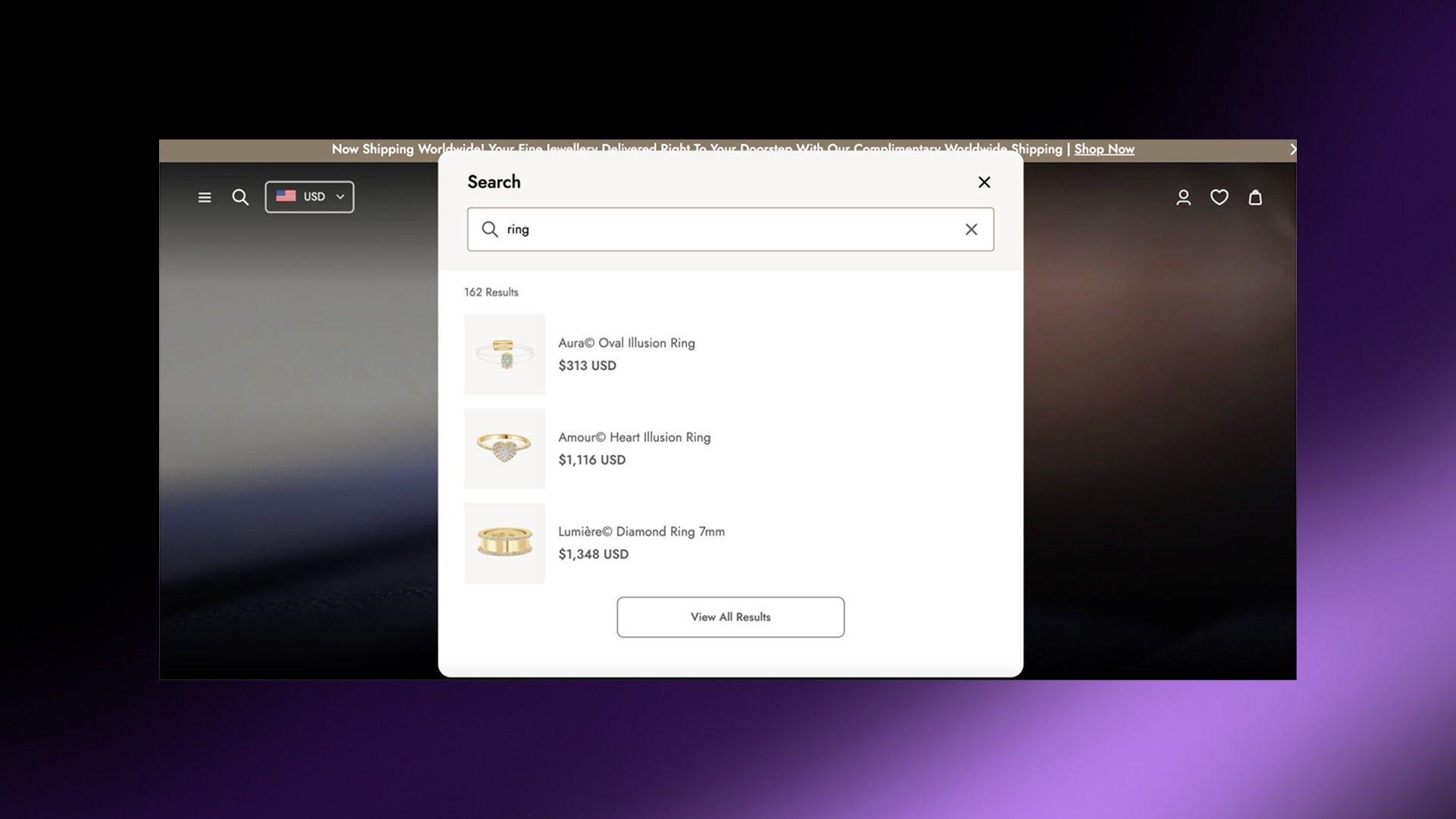
☑️Make your search bar smart. Add auto-suggestions so it guesses what people are looking for.
☑️Include filters (like price, size, or color) and sorting options in search results.
☑️Add voice search for mobile users if possible—it's a game-changer.
Goal: Search → Product Page in 1 click.
☑️Your site needs to work perfectly on phones. Most shoppers use them.
☑️Use a hamburger menu (the three-line icon) to save space.
☑️Make buttons and links big enough to tap easily.
Goal: Home → Category → Product Page in 2 clicks on mobile.
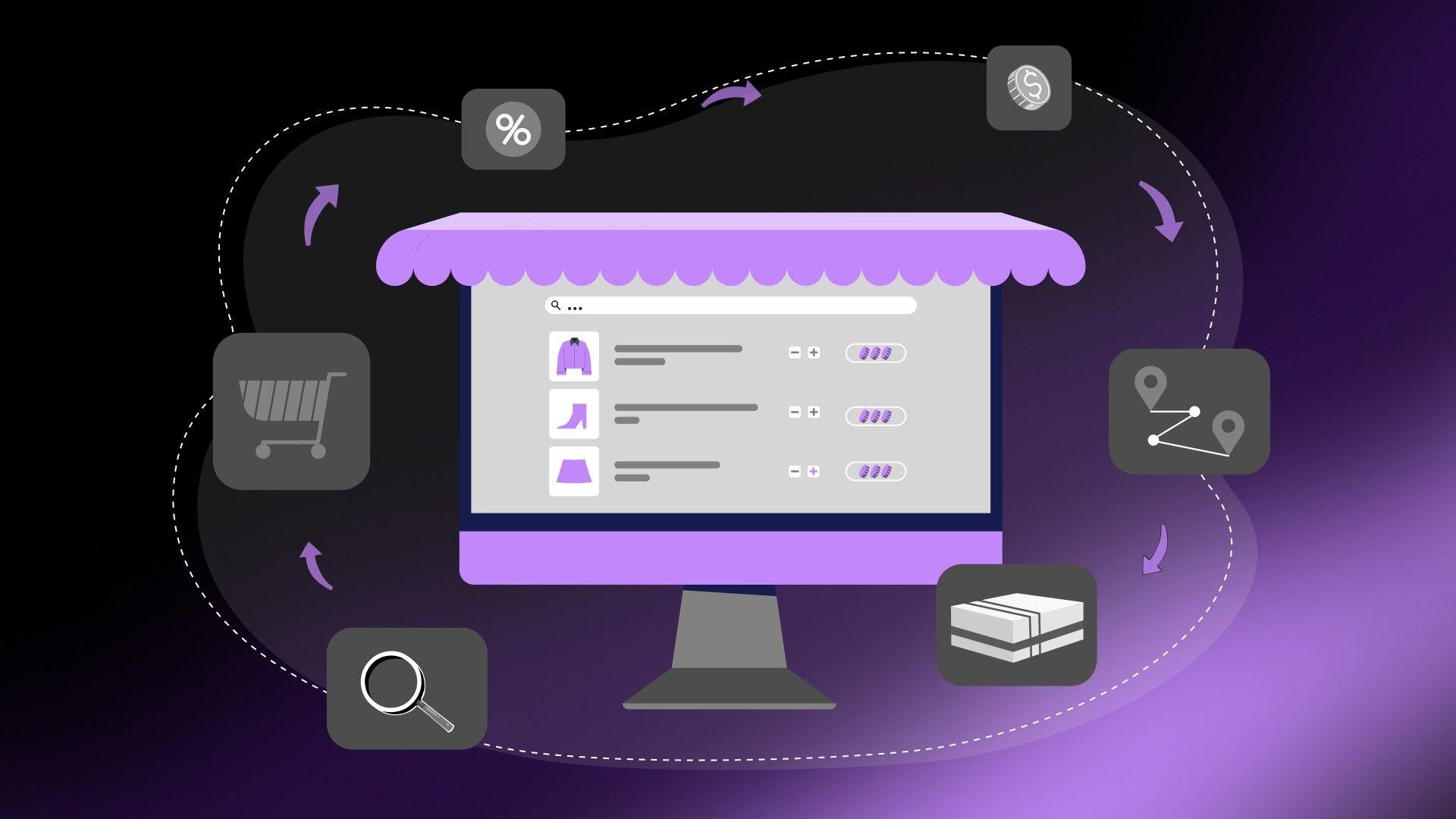
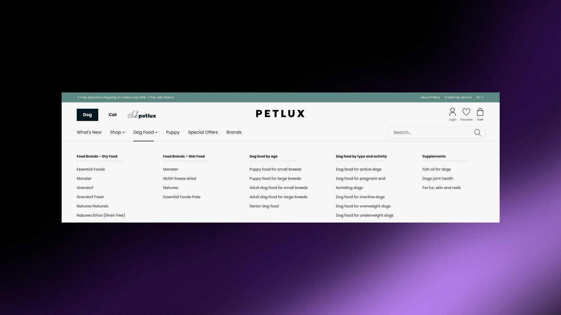
☑️Organize products in a way that makes sense. For example, "Men's Shoes" → "Running Shoes."
☑️Add filters for things like price, size, color, and brand.
☑️Include a Recently Viewed section to help people pick up where they left off.
Goal: Home → Category → Filtered Product → Product Page in 3 clicks max.
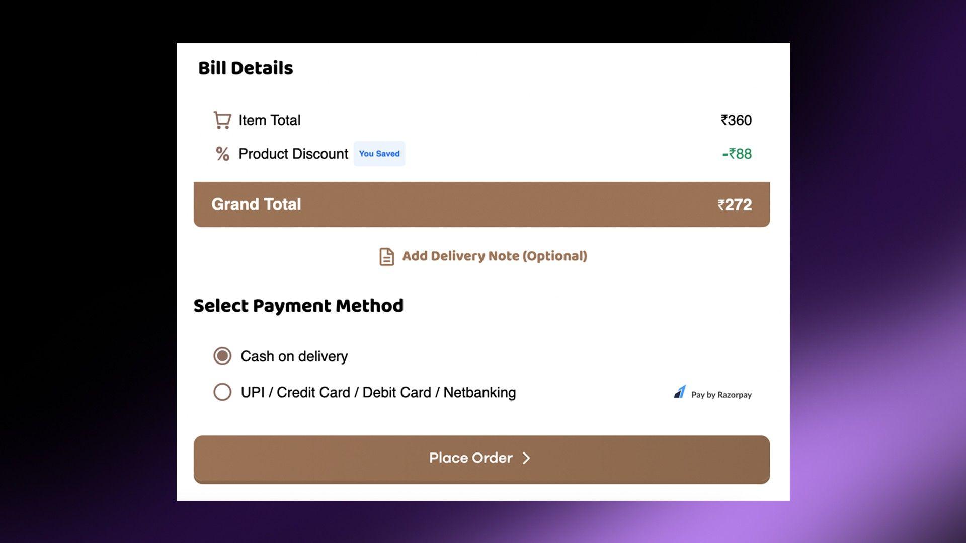
☑️Let people check out as guests—not everyone wants to create an account.
☑️Cut down on form fields. Only ask for what you really need.
☑️Offer multiple payment choices like debit cards, PayPal, or Apple Pay.
Goal: Cart → Checkout → Payment → Order Confirmation in 3 clicks max.
Read More: Three Page Checkout vs. One Page Checkout for Shopify Merchants.
☑️Compress images so they load faster.
☑️Use a CDN (that's Content Delivery Network) to speed up loading times.
☑️Minimize redirects and clean up your code.
☑️A slow site is a dealbreaker.
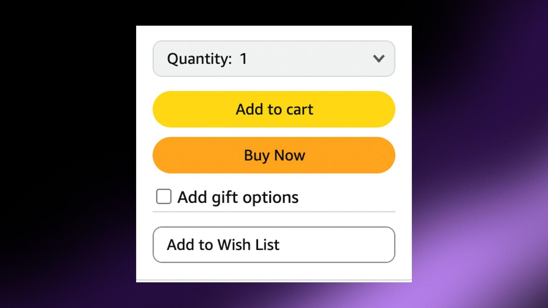
☑️Make your buttons say exactly what they do like Add to Cart or Buy Now.
☑️Put CTAs where people can see them—like at the top of the page or next to product details.
☑️Use colors that stand out so they're easy to spot.
Goal: Any page → Checkout in 1-2 clicks.
The goal here is simple—make it easy for people to find what they want and buy it without hassle. The smoother the experience, the more sales you'll make.
If your site’s navigation is confusing, you’re losing sales. It’s that simple. Shoppers want to find what they need quickly and buy it without any hassle. The smoother their journey, the more likely they will stick around and hit that buy button.
The fewer clicks it takes to get to a product or checkout, the better the experience.
So, take a good look at your site.
Regularly audit and refine your navigation to keep it smooth and customer-friendly.
Because at the end of the day, a great shopping experience isn’t just pleasant to have—it’s what turns browsers into buyers.